Wednesday, 1 June 2011

OUGD 303 Evaluation

I aimed to create briefs that would take me out of my design comfort zone. I wanted to create a portfolio that had depth in terms of audience and showed I could work professionally for a number of clients, which I feel is more useful to a future employer. I feel that this is apparent within my current portfolio and have had positive feedback from industry professionals.

The Mart brief went well in terms of identity design but I felt I could of pushed the identity across a number of products and made these products rather just create the artwork. If I was to do this again I feel that action planning and time management would help me massively if I were to stick to deadlines. I felt that researching into things like different stocks and print methods would of taken this brief further, but this is something that at the time I didn’t feel would make any benefit.

Again with the Kestrel Film Works brief I was more interested in creating the idea than the actual product, the newspaper came out well but there were things I would change, the size of type was unexpected and some layouts could have been better in terms of eye for detail. Producing to scale mock ups would have solved this problem and I could of made amendments.

Within the Sarah Walton brief I feel that more documentation of development would of helped me gain more marks in terms of ticking boxes and would of maybe created more ideas of how to push the brief. Again creating more mock-ups and proofs would of solved problems like the type being too close to the gutter and too close to the page edge.

I also got use to working with clients rather than with my self with this module, the Maxwell Rushton brief helped me deal with a client and also made me work to a professional time scale sticking to deadlines the client set (although I did not document them). The downside to this is that I did not document my development and thought process. I felt the outcome was of a high standard but again could have been polished off a little more.

It seems that over all my practice needs that little push where I take what I think is a finished product to the next level, This was evident within the Hannah-Rachel brief where I felt the idea was good but the outcome could have been pushed a little more and developed to a point where it became a stronger idea.

I felt my design work and ideas generally solved a problem but I did not document and plan enough of my practice. I found it hard to step back and take a look at what I was doing as I felt this would stop the flow of work. This was also apparent within the later stages of the mart brief where I had the entire asset’s to design but didn’t really try and test different methods of products etc.


To progress in the future I need to do the following things.

-       - Once an idea is thought to be finished, step back and evaluate and then try to push the idea or design further.
-       - Create action plan and stick to them, in terms of the module I would make the action plans and document them so it is evident that I has stuck to them.
-        -Create more products to a proof standard this would mean that products of design would be produced with a high standard of detail.

Within this module I feel I have progressed my own practice and found an area of design in which I sit. In the past I have investigated with a number of design disciplines but feel that the areas of identity design and branding is where I want to work. Through – out the briefs I resolved in the FMP module I felt this was evident. I think I have learnt a lot about what a brand is in researching for my design context investigation, this has helped me realise how to design for a brand or create one. 


I feel I still have a lot to learn in terms of industry but I have gained a good platform of learning to progress into a professional enviroment. This was evident on my placement where I understood what was expected but learnt a lot about doing work that isn’t self initiated and has to go under a large amount of development with a client. I felt at times this is where my work within FMP declined, as I was the client and didn’t have that opposing view to bounce off. This was probably most apparent within the Warp Records secret brief where I developed ideas but did not develop (in depth) the execution of the design.

Monday, 23 May 2011

Hannah-Rachel Brief

Warp/YCN Secret Brief.

Maxwell Rushton Brief

Sarah Walton Brief

Kestrel Film Works Brief.

The Mart Theatre Brief.

The Mart Theatre Final Boards


Open publication - Free publishing - More art

This brief was devised to create work that was out side my comfort zone teaching me that high concept and strict type wasn't always appropriate for all briefs.

It made me improve on my analyzation skills making decision about what was appropriate but still too a good standard. This will put me in good steed for when I work for client who doesn't understand that a poster with simple clear typography sends a clearer message than a poster with a short shorty on and a load of messy photographs on. I am quite happy with the outcomes and feel it will benefit my portfolio.

I think i could of improved on making products and actually trying and testing things to get the design spot on.

Although i haven't made products i have artwork them to full final copies and specced up what they will be made of and how they will be printed.

I worked with a photographer on this project and at times i felt let down by the quality of the work. To improve on this next time i shall be more careful when choosing who i work with and brief them properly before letting them produce work.


Kestrel Film Works Final Boards.


Open publication - Free publishing

Within in this i felt i learnt about listening to the client and taking what i had got from them and turning it into something that met the brief of the client but was also a good piece of design.

I had to work to restrictions which i think helped me make decision and feel this is something i will do in the future to help me progress within briefs.

I had to learn to plan out what i was placing where within the product and also select photos which i thought looked best and got the message across. I now feel comfortable looking at others work and selecting what should be used for why and then passing this information on to the client.

I also dealt with images which is something i have not really done before this got me used to working with photoshop again and increase my skill set when editing photo's and saving them in the correct file type and manor.

I feel i should of produced more prototypes and mock ups as the size of the information looked fine at screen size but then was a little larger than expected when collected from the printers.

The reason for not producing mock ups was due to poor time management and planning. I will avoid this in the future by sticking to deadlines and not putting stuff to wait.

Maxwell Rushton Final Boards


Open publication - Free publishing

This brief was original planned as a short couple of days brief but as i work with the client I decided to take the brief further to gain experience of dealing with a client who wants and think different stuff from you. I learn't how to deal with the client and persuade him that what i was planning was not just a thought but was backed up by research and explained simple design elements to him.

This will make it easier for me to deal with and present work to clients in the future weather it be in a studio i work for or as a freelancer.

I also took a back seat to using a icon as a logo and thought more about how i could implement different media's into the design of the mark which is something i didn't do before.

I learnt how to cost things up and charge some one and work to a professional standard ensuring i would get more work from the client.

Again i had to work with imagery that was some one else and had to make decision's which is something i set out to learn.

Hannah-Rachel Final Boards


Open publication - Free publishing

Within this brief i felt i have developed my designing for web knowledge and digital asset management skills. I had to get all files ready for the website being built and had to re design things so it would work.

Again i flet a big part of my FMP was dealing with clients. I felt that working for my self, I was the client and i was happy with everything i did and made decision about. Working with a client who wasn't my self made me use person skills which i didn't think i had and also go through ideas and concept with the client at initial stages. It made me ask the client question that sometimes they didn't even know and had to get back to me with the answer creating a much more clear brief.

I Also felt i developed my idea think skills when thinking about promotional tools for hannah.

I felt i could of improved on the final out comes of products but sometimes it's hard to produce the kind of products you want when the facilities don't cater for it.

Sarah Walton Final Boards


Open publication - Free publishing

This brief helped me create design that wasn't something that i particular like or to my personal design preference. Creating more feminine work for a more diverse audience.

I also learnt to work off the computer and think about idea that involved mix media and different paper stocks. This including printing onto material, learning about stitching and what was possible with etc. I used software i hadn't before and this has given me knowledge i wouldn't of know otherwise.

I felt i could of improved by making more mock ups and looking at more paper stock and methods of production etc. This would of increased my knowledge when creating bespoke publications.

I think the brief helped me produce work that will give me a more diverse portfolio and will show i can design for different clients not just one.

If i could do the work again i would plan my time more efficiently and create more mock ups and formats when producing publications which will increase my knowledge for design for print.


Warp YCN/Secret final boards.


Open publication - Free publishing

This brief let me explore design for music and look at how music is marketed and how will be in the future. It also allowed me to create design that gets me excited.

I learnt about how a brand can interact with it clients through digital means and be backed up by traditional products.

I felt that my idea and concept was proven to work and the boards show that. I thought about the brief more like a story rather than a product which helped me dramatically.

I also thought the design at times was a little weak and could of been executed to a better standard but i do feel that this work will show in my portfolio that i can produced ideas and concepts that differ from he average.

I developed skills within research and idea generation this was evident at the beginning of the brief where i had to many ideas to do and had to be selective when deciding which ideas to take forward.

Friday, 20 May 2011

The mart stationary


The stationary has used the same photography that was used within the website design creating visual consistency through the brand identity.

The white box allows for the letterheads and compliment slips to be hand written on and printed on through a printer.


Specs.
- Compliment slip 210 x 99 mm full CMYK digital print  120gsm Conqueror Stonemarque paper
- Letterhead 210 x 297 mm full CMYK digital print 120gsm Conqueror Stonemarque paper
- Business card 85 x 55 mm full CMYK digital print 400gsm FSC silk artboard (50% recycled)

The mart theatre website.


The site has been designed with ease of use in mind. the design is friendly and consistent which creates an established look.

The site is design a 900 px wide so that all users can view the site without any problems.

Rounded corner have been add to the imagery to create a less harsh more friendly look.

Wednesday, 18 May 2011

Secret records range.


Secret screen printed vinyl sleeves.


I don't know if i explained this brief properly but i wanted to put my design ethics into this brief as much as possible.

Personally I believe that most things that are designed these days is either over the top or the visual aspect of design over powers the communication.

So the design direction for this brief is to be simple, clear and minimal creating a almost neutral look that suit the context of the brief.

The disco bags are screen printed one colour with information and mark. they are mass produced and can be used through-out the product ranges life time.

Kestrel film works - development and extention.

Along with the promotional newspaper i've though about how i could extend the and push the brief.

The pack will now consist of the publication of work, a showreel, business card and poster.


Monday, 16 May 2011

Design context update.

From looking around the net and diving deeper than the studio's I like the work off i have found a brilliant guide to branding from the design council it offers a in depth but quick hit guide to branding for people wanting to start up business.

http://www.designcouncil.org.uk/Documents/Documents/Publications/Power_of_branding.pdf

It also offers some brilliant research for my design context brief.


The current design of my book is a square format publication that will be printed a lulu ( hopefully ) but i have though about how else this publication/case study/research document will exist.

My plan is too create a mini site held on my own site that is a exploration in to branding and looking at how design agency's working within the world of branding.

secret/Warp posters

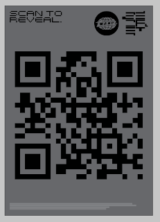
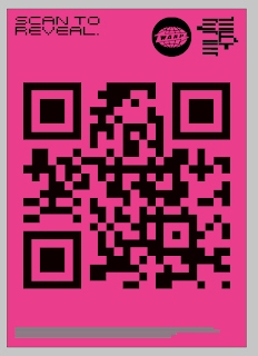
So along side the dubplates and there design these posters will be plastered up to create a campaign.

The poster have been designed to provoke question and inquisition. Not everyone will use the poster to gain access to the dubplates but it will create brand awareness and loyal warp fans will see the warp logo and wonder what it's about.

The bold colours will be attention grabbing and amongst the other busy music based posters and art work will stand out and create a seductive product.


warp record stickers. 2

After looking at the previous stickers perhaps there was more of a way the colour element can be used within the design making more of a point of which dubplate is which?

I decided to make the sticker more subtle and still as legible but change the design so the colours were more apparent.


Followers